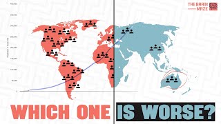
This animation brings global data to life using information from Our World in Data. Countries are color-coded by life expectancy, with greener shades representing longer lives, showing how longevity has changed across the world over time.